With over 547,200 new websites popping up every day around the world, it’s important to know how to stand out from the crowd and what could be preventing you from getting sales.
I tell people this all the time, “presentation matters”, especially when selling physical products on your website. Before even deciding on what technology to use for your digital storefront or where to host your website, be sure to make sure that the images of your products are as good as the benefits they provide.
You do not need to be a professional photographer to take professional photos. Many of the smartphones today come with excellent cameras that can take great photos that are professional quality. The real secret behind great product photos has little to do with the resolution of image quality, but how the photo is being taken.
How To Take Photos the Right Way

Setting
When taking your photos, be sure that the setting and background compliments the product being sold. For example, if you were selling fishing gear, it would be logical to theme your product in an outside setting like on a rock, inside a tackle box or boat. Or if you're selling liquor, placing the bottle next to a filled glass on a wooden patio table or inside a cooler with a shoreline behind it would be a great idea as well.
What if you don't have a setting
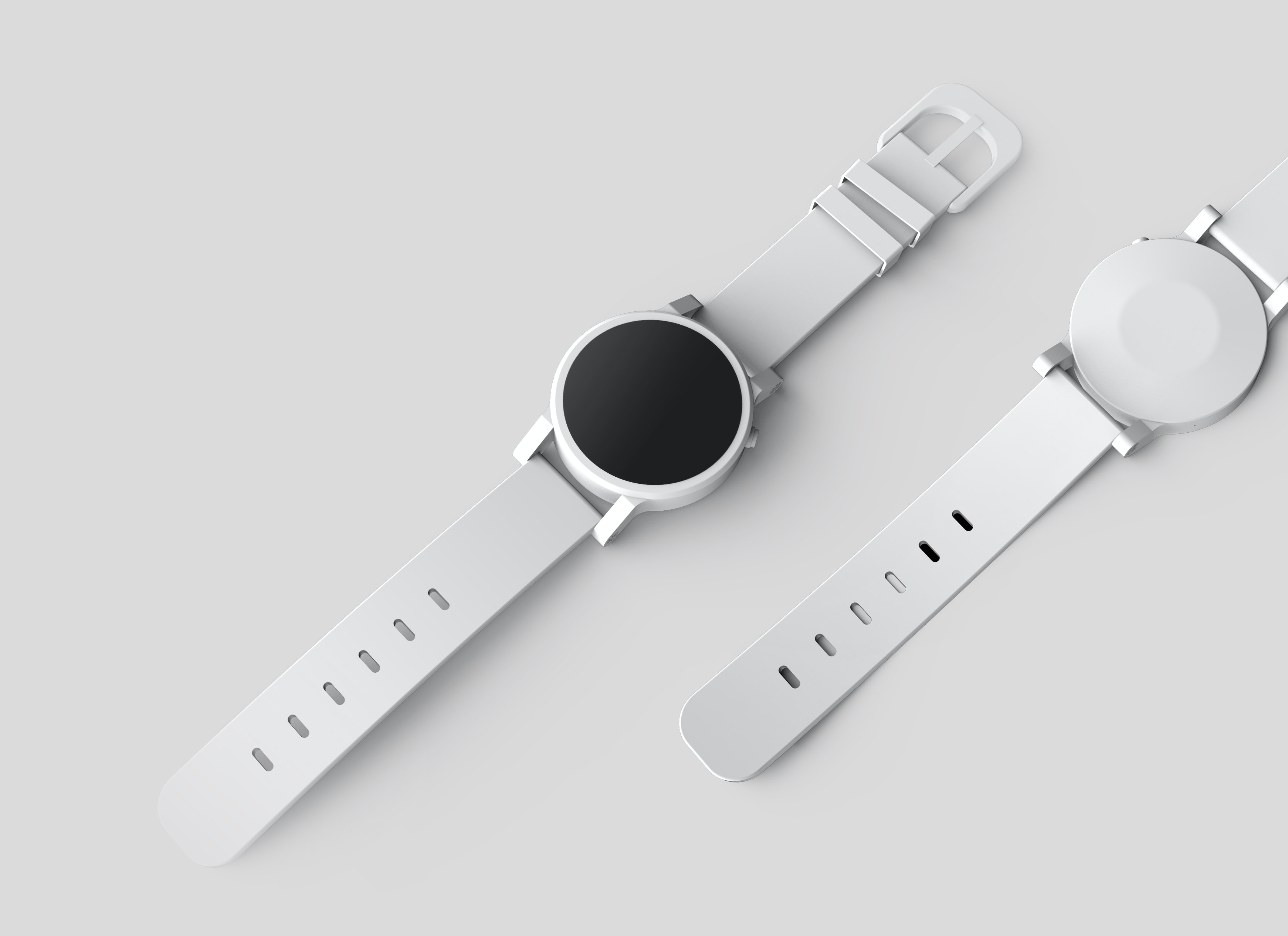
Luckily for you, solid color backgrounds are still popular and will make your products look very clean and presentable. Take a look at the examples below.
Lighting
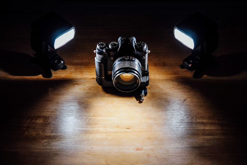
Proper lighting is actually more important than the setting. It can alter the viewer’s perception of what they see and how they see it. Lighting can also help enhance your surroundings by reducing the focus of elements that will distract your view or make your product presentation look quite amateur.
You can buy cheap lighting kits for under $50 from sites like Amazon to get you started. If your home, business or place of photography has great access to sunlight like an east or west facing window, this can replace the need for artificial lighting. Try playing around with natural lighting first to see how that suits you.
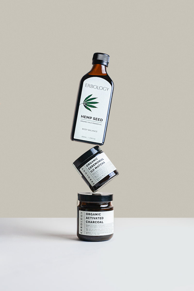
In the example below, we see that a simple white setting and great lighting can create great product photography. Notice how the setting, the lighting, and the shadows make the products pop from the background and accentuate their colors.
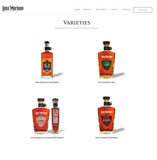
In this simpler example, the products were placed against a white background and shot with a mobile device. We see that we can still take great product pictures that align with the brand with a simple background, simple lighting and simple photography equipment.
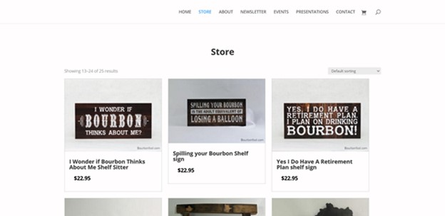
In both examples, the images are presented front and center to make the pictures stand out and engage with the customer.
Multiple Views
The higher the price, the more likely people will want to look more into the product of interest. Having several pictures of the product in different angles and use cases can help the shopper see how the product should be used and what it’s used for. If you’re using a model, you can have this individual smile or show positive emotions while using the product to encourage the buying behavior.
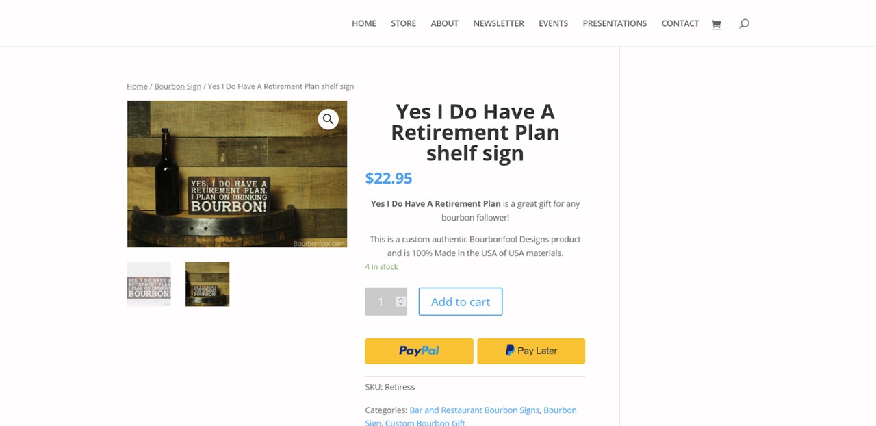
In this example, we see the detail for one of the products featured above on the store page. Making the product visible against different backgrounds and in multiple angles gives the customer more of a feel for the product and helps them imagine it in their own life.
Uniformity
Make sure the pictures you take have similar backgrounds that align with your brand. All pictures online may not match your brand identity perfectly and this is why some companies hire a photographer to help them with this part. If you do not have the means to hire a professional photographer, there are millions of photos online that can be used and many will have your color palette.

Looking at the images above, the images presented have the same background themes that align with the overall brand. This consistency presents an appropriate brand experience to the customer.
Complementary Photography
Complementary photography that would typically go into the header, or around your site as supporting content can affect buying behavior as well. This is quite tricky if you aren’t aware of design fundamentals. At Versa Agency, we have helped numerous businesses get grounded with web design that encourages buying behavior. See our post on Banner photography for more.
The main thing to keep in mind is theming for the most part. Unsplash and Pexels are image directories that will allow you to search high quality royalty-free images. Be sure to compress the images to the smallest file size to prevent your site from slowing.
Conclusion
At Versa Agency, help businesses create designs that their customers will enjoy. Whatever you can’t do, let us assist so you can focus on the things that matter the most.
Give us a call today!
