Engaging visuals are the secret sauce of a great design system and a hero image is the delicious cheese that melts on the patty that makes this “meal” one to remember.
The hero image is where your visitors will look to get a quick grasp of what your company is all about and what your value proposition is.
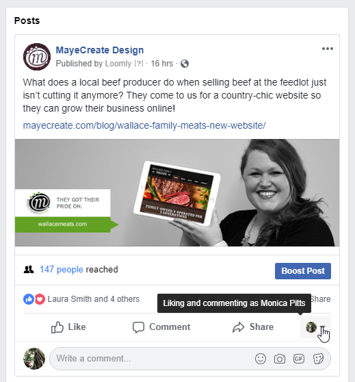
Hero images can also be optimized to be shown on social media posts and comments such as the image above. This is a secret weapon you can take advantage of to help you increase conversions and brand prevalence, only if you don’t shoot yourself in the face with it.
Here are some guidelines to follow to ensure your hero banners are doing what they are supposed to do, grow your business.
Quality
It’s also wise to consider the sharpness of the image being used. Let's say you were to have a user that’s viewing your site on a wider viewport. Impurities of images tend to be more noticeable.
Image quality is not always in your control so it’s also best to keep in mind what photos to use. I tend to use images that are originally large in dimensions ( anything over 1920 x 1080 and above ) so that there will be a minimal amount of loss of quality.
Dimensions
Sometimes, an image that looks great as the hero banner for desktop does not look as well on mobile. It’s essential to build a page for responsive design. That means sizing it according to the device it’s being viewed on.
There is no such thing as a “perfect hero image size” but keeping it within a reasonable range is highly recommended.
The most popular desktop viewport size as of 2021 is 1920 x 1080 pixels. Any hero image that is at this resolution will suffice. It will have a high enough resolution and won't take up too much time to load due its resolution and file size.
I strongly recommend keeping images under 200kb if possible. The Squoosh app allows you to resize and compress images on the fly for free.
The dimensions of your image can be modified using CSS and media queries as well. You can make a desktop header fit well on a mobile device by just adding a few lines of code. There are many website builders that will allow you to make these changes without knowing CSS.
Relevance to Content
Hero images should also contain branding elements, products you sell and some sort of call-to-action to take your users to a shopping area or a form.
Be sure that the written content in hero image is short, simple and to the point. The more a user has to read, the less likely you'll earn their business.
Text in the hero image should not be included in the image file. Instead be sure to put all text in HTML format so that it can be read by search engines and crawlers.
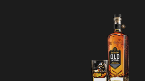
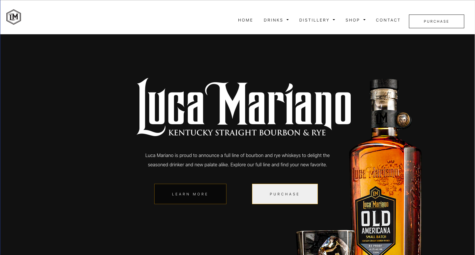
Example: Luca Mariano
Here is an example of a hero banner that has a been sized properly with a related product as the main subject. In this case, we optimized by specifying the placement and opacity. We knew we wanted the bottle and the liquor to be visible. We also knew we wanted it to play well with the descriptive text. Therefore, we modified the image so that the bottle and glass is on the right away from the center to give room for text and a button if one were to be added.
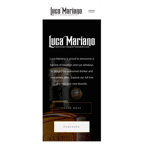
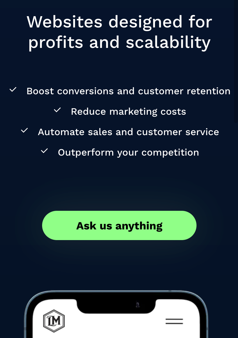
Here is the same hero banner optimized for mobile. It's not always realistic to make the hero image look exactly like the desktop version due to aspect ratio. Changing the position or even replacing it with another image for this view is a common practice.
On the mobile view, we positioned the bottle to be in the center so that the user can see the main branding element from the desktop view. We also reduced the opacity so that the text is more visible as well.
We also wrote copy to help the user understand what the product is about and why they may want to buy it.
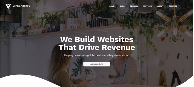
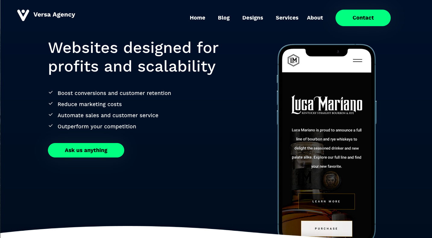
Example: Versa Agency
In this example, we replaced the older header with the new design to make the hero image more relevant to the content and services we offer. We simplified the design of the header with content geared towards our services. This improves the viewing experience and explicitly informs the users of the benefits of our services.
Text over the face isn't the best design practice since it covers the main subject of the photo, which in this case is not the most relevant to the content displayed. We added a new design to the header so that it complements the brand and makes it easier to read.
Conclusion
With the amount of competition on the web, hero images must be optimized properly for the type of customers you desire. The Versa Agency team have decades of combined experienced working with different businesses by helping them to achieve their goals with design and technology.
Feel free to shoot us a message to talk more about your project so we can help you get on the road to success!