Live Free America

Live Free America
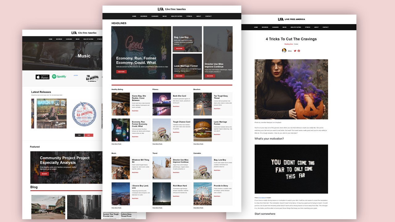
The owners of LFA wanted to restart their brand. In years prior, they had a sizable following, but the brand had become dormant. We redesigned the website with a more journalistic look and feel that would attract users and align with their social media presence. We restructured the theme of each page to create reinforce the journalistic feel. Taking cues from well known journalism brands like The New York Times and Vox, Bourbon lifestyle brands like GoBourbon, BourbonOutfitters, and design platforms like Behance and dribbble, we ensured a modern look and feel to keep LFA relevant in the digital age and maintain the existing brand identity of Live Free America.
Technologies
- Javascript
- Recaptcha (spam prevention)
- Backup and security
- Hosting
Deliverables
- Brand Strategy
- Responsive Layout


How we helped

We began with a prototype modeling an online news publication. In this way, we created a more journalistic look and feel.
- A feature card layout on each page aesthetically guides readers to the top news stories we are promoting.
- Content layout on each page contextually guides readers to the content they seek.
- Section spacing on each page builds curiosity for content as it leads readers through the page.
- Carousels on appropriate pages lead users through product offerings with a sleek, modern touch. Carousel "sandwich" diversifies content offering while maintaining immersive media experience for user
- Branding is incorporated into design aesthetics, with accented elements used to embellish brand identity.

We created a batch of starter content and sourced online writers to help restart Live Free America's content engine.

We optimized performance for faster page load. Prioritizing the user experience, we made sure files were not downloaded until they needed to be present on the page.

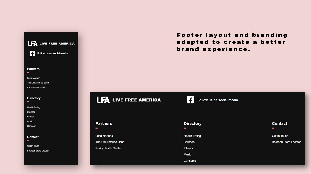
Footer layout and branding adapted to align better with brand.
